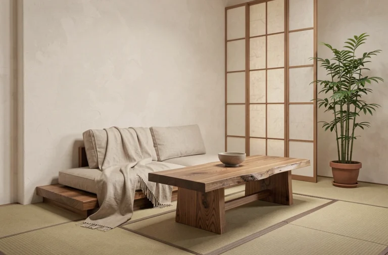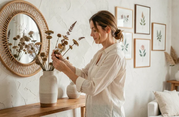
Harmonious décor is based on a simple technical principle: visual consistency between the materials, colors, and proportions of the furniture in a given space. Transforming your home isn’t about accumulating decorative objects, but about creating a logical relationship between every element in a room. This approach can be learned, structured, and adapted to any budget.
Air quality and furniture choices: a decorating factor often overlooked
Before choosing a piece of furniture for its style, color, or dimensions, there’s one factor worth considering: its emissions of volatile organic compounds. Particleboard, MDF, and some plywood products can emit formaldehyde, an irritant found in manufacturing adhesives.
In France, unlike certain building materials, which carry a regulatory label ranging from A+ to C, furniture has no comparable labeling to help consumers easily compare emissions. In October 2026, JDN reported that a European regulation setting a formaldehyde emission limit for furniture sold in the European Union had come into force. However, this limit does not mean that furniture is entirely free of formaldehyde.
In practical terms, whether you’re planning a decorating project with Imagin’Air Déco or any other home makeover, choosing solid wood, finishes made with bio-based paints, or secondhand furniture can reduce exposure to these substances. It’s a choice that combines personalized style with better indoor air quality.
Color palettes for a cohesive home: the rule of proportion
Color is still the most visible tool for transforming a space. The challenge isn’t choosing a shade, but combining several shades in the same room and then carrying them from one room to the next.
Build your palette around three levels
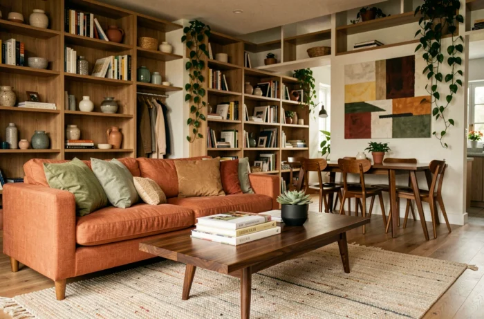
A practical palette is based on three color levels, each used in different proportions:
- The dominant color covers most surfaces (walls, floors, large pieces of furniture). It sets the overall tone, often neutral or soft, and provides a backdrop for everything else.
- The secondary color appears on mid-sized elements (curtains, rugs, accent chairs). It adds contrast without overwhelming the space.
- The accent color is reserved for decorative objects, cushions, or a single feature wall. It gives the room its distinctive personality.
This principle works with any style. A Scandinavian interior uses this balance with white as the dominant color and wood or mustard accents. A more contemporary interior might reverse the intensities, but the proportions between the three levels remain the same.
Creating a color transition between rooms
To maintain a cohesive feel throughout the home, the dominant or secondary color in one room can become the accent color in the next. This visual thread avoids a “catalog” effect, where each space feels like it belongs to a different home. For example, terracotta used as an accent in the living room could reappear as a secondary color in the entryway, perhaps on a bench or coat rack.
Materials and textures: create personalized décor through contrast
Color alone isn’t enough to bring a space to life. A variety of textures adds depth that color alone cannot provide. A living room made entirely of smooth surfaces (glass, lacquer, polished metal) can feel cold, even with a warm color palette.
The idea is to combine at least two material families with contrasting textures in each room. Pair raw wood with linen, matte black metal with velvet, or glazed ceramic with woven rattan. These tactile contrasts create sensory richness, making a space feel personal without adding more objects.
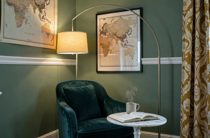
Secondhand finds as a source of character
Adding secondhand furniture or objects is one of the easiest ways to create an interior that looks like no other. A vintage dresser that’s been repainted, a salvaged antique mirror, or a sanded farmhouse table brings a patina and a story that new furniture can’t replicate.
In its overview of reuse and repurposing in France, updated in 2024, ADEME distinguishes between consumer goods and building materials. Furniture reuse is growing, but reuse of construction materials remains particularly uncommon. For interior decorating, the secondhand market already offers a wide selection of furniture, lighting, and decorative objects, while finding architectural elements such as vintage tiles or wood paneling takes more effort.
Proportions and movement through a space: the invisible framework of a successful interior
A harmonious layout depends as much on what you place as on what you leave empty. Open space around furniture has a greater impact on comfort than the number of pieces in the room.
Two principles guide a good layout. The first is circulation: every walkway between pieces of furniture should allow people to move around easily. Fitting a sofa, coffee table, and TV stand into a modest-sized living room means measuring the actual distances, not just imagining how you want the room to look.
The second principle concerns vertical proportions. A room with high ceilings can accommodate tall furniture, large-format artwork, and low-hanging pendant lights. In a room with standard-height ceilings, low-profile lines (low furniture and wall shelves instead of imposing bookcases) help prevent the space from feeling cramped.
- Measure the remaining clear floor space after placing the furniture: it should make up a significant part of the room, not just whatever is left over.
- Keep seat heights consistent (sofa, armchairs, ottomans) to create a calm horizontal line in the living room.
- Group small decorative objects in sets of three or five rather than scattering them around, creating a focal point instead of visual clutter.
Transforming an interior has less to do with budget than with making thoughtful, consistent choices. When colors work together, textures complement one another, and furniture suits the proportions of the room, a sense of harmony comes naturally. One final habit to adopt: check what the things you buy are made of, because a healthy home is an essential part of a successful one.