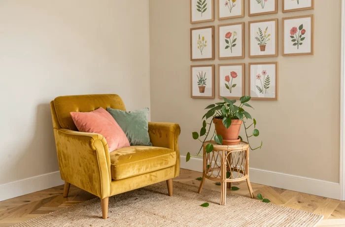
The serotonin decor is not just about placing a yellow cushion on a gray sofa. It involves three sensory levers (color, light, texture) to provoke a measurable physiological response. We recommend treating each room as a system where these levers interact, not just as a surface to decorate.
Color temperature and light spectrum: the technical foundation of serotonin decor
The production of serotonin in the brain directly depends on exposure to natural light. Before choosing a wall color, we analyze the available light spectrum in each room. A saturated color placed in a poorly lit space produces the opposite effect of what is desired: it absorbs light, darkens the room, and generates visual fatigue.
The basic principle: place living areas near windows and favor light, transparent curtains in daytime rooms. Blackout curtains are reserved for bedrooms, for the sleep phase. This choice of drapery radically changes the perception of wall colors between 9 AM and 5 PM.
When natural light is abundant, warm saturated shades (terracotta, saffron yellow, coral) work without overwhelming the space. In a north-facing interior, we shift to moderately saturated, lighter tones, combined with layered artificial lighting. A minimum of three light sources per room (diffused ceiling light, reading lamp, ambient wall light) allows for modulation of the perceived color temperature throughout the day.
To delve deeper into these color principles applied at home, the serotonin decor on Cécile Bricole details several tested combinations room by room.

Color palette for a joyful interior: beyond the color wheel
Most articles on dopamine decoration simply list bright colors. The problem is that saturation without strategy produces sensory overload, not well-being. We work with a precise ratio: one dominant color on large surfaces, one complementary color on furniture or textiles, and a limited accent color on objects.
Dominant, complementary, accent: the operational ratio
The dominant color covers walls and floors. It remains at a moderate saturation to avoid tiring the eye. The complementary color appears on the sofa, curtains, or a main piece of furniture. The accent, the brightest, is limited to repositionable objects: vase, frame, cushion.
This system allows for evolving the decor without repainting. Changing the accent objects is enough to refresh the feeling of the room. We observe that this approach works particularly well in small spaces (studios, student rooms) where the mental load related to visual clutter is stronger.
Concrete associations by room
- Living room: off-white or rosy beige walls (dominant), sage green or petrol blue sofa (complementary), mustard yellow cushions and coral ceramics (accent)
- Kitchen: light background, turquoise zellige tiled backsplash, natural wood accessories, and terracotta dishes
- Bedroom: lavender or powder pink walls, ecru linen bedding, brass bedside lamp, and a few touches of olive green
Textures and tactile materials: the underestimated sensory lever
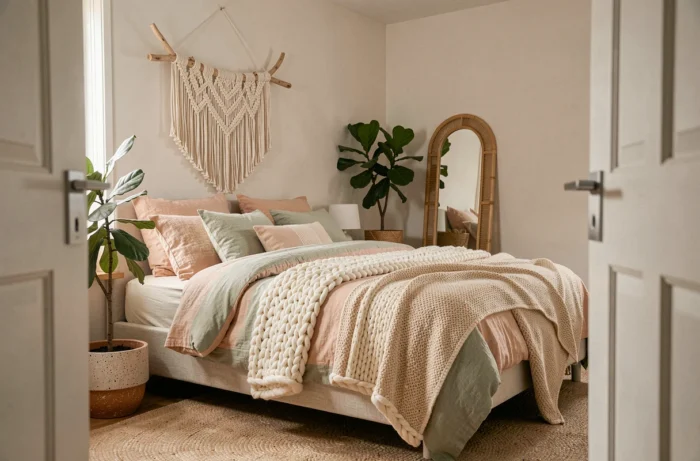
Color captures attention. Texture holds it. A serotonin interior relies as much on what we touch as on what we see. Natural materials (raw wood, linen, boucle wool, rattan) activate a comfort response that smooth and synthetic surfaces do not produce.
We recommend layering textures in each area. A corduroy sofa paired with a wool throw, a jute rug, and linen cushions creates a tactile gradation. The brain interprets this diversity as a signal of safety and warmth, promoting relaxation.
Natural wood and plant fibers: functional choices
Solid wood and woven fibers (rattan, wicker, raffia) provide a visual irregularity that the brain associates with natural environments. An untreated oak table, a wicker basket, a raffia lampshade are enough to anchor the room in an organic register, even amidst bright colors.
This contrast between chromatic vibrancy and earthy materials is the signature of a well-executed serotonin decor. Without this grounding, joyful colors turn into a superficial decor without sensory depth.
Serotonin decor in small spaces: studio and bedroom with high mental load
In a studio or a student room, the margin for maneuver is limited. Every object counts double: it decorates and it clutters. The rule we apply is simple: an object that does not provoke either visual pleasure or daily use should be removed from the room.
Students and young professionals who adopt this trend rely on layered lighting (table lamp, low-voltage string lights, adjustable wall lamp) to compensate for the excitement of bright colors on small surfaces. This modular lighting setup allows for transitioning from an energizing atmosphere during the day to a calming ambiance in the evening, without changing the decor.
- Favor multifunctional furniture: storage bench, wall-mounted folding table, open shelf serving as a divider
- Limit bright colors to removable textiles (cushion cover, bed throw, curtain) to adapt the visual energy to one’s mood
- Hang a mirror facing the window to multiply natural light and visually enlarge the space
Serotonin decor does not require large volumes. It demands coherence between light, color, and material. A small space well-calibrated on these three axes provides more well-being than a large living room decorated without intention. The final criterion remains personal: every visible object should trigger a micro-positive reaction; otherwise, it has no place.